
We have a winner!
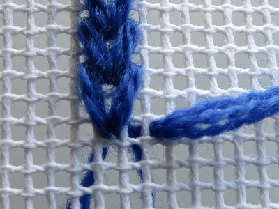
Louise from Australia is the winner of the mystery Blue/Green study. Louise correctly identified the technique as an embroidery technique – known as the knitting stitch – performed on needlepoint canvas. Here is a picture showing the piece and the canvas.
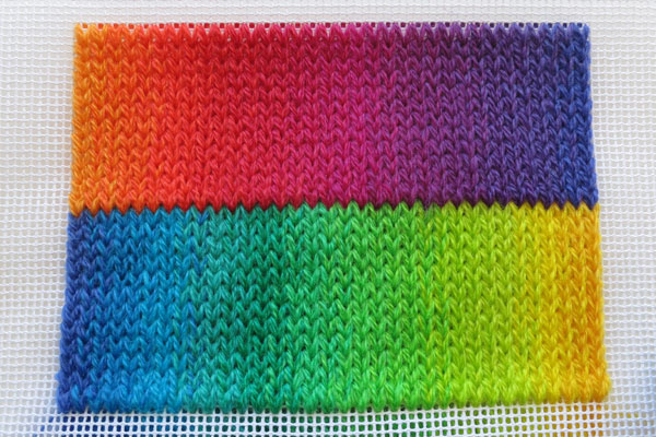
The specific technique I used to create this piece was a modified knitting embroidery stitch on needlepoint canvas (12:1) using three strands of the Lace weight merino yarn. As this embroidery stitch is made in columns it allows you to graduate colours vertically easily.
I graduated in three steps (columns) to the next colour and so on around the rainbow. The original knitting embroidery stitch is 4 squares high. But, I thought it looked too long compared with actual stocking stitch so I modified it be 3 squares high.
Below is a step by step photo tutorial on how to make the stitch.
Louise will be receiving the prize of her 5 favorite colours in the Marta’s Yarns mini skein range. Also, as a special thank you to everyone who participated in my first online competition, all submitters will be emailed a 20% discount coupon code for an order from the Marta’s Yarns collection of knitting yarns.
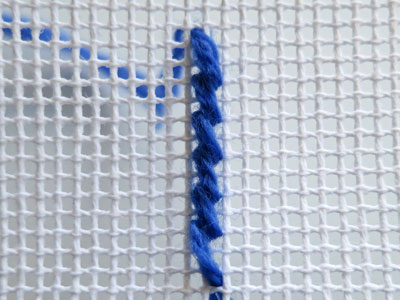
Step 1 – Commencing at the bottom left corner of the area you wish to embroider, bring three strands of the lace weight yarn up through a square in the canvas. We will be working the pattern from left to right so make sure you allow enough space to the right of your starting point.
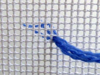
Step 2 – Insert the needle three squares up and one square to the left.
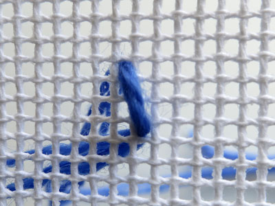
Step 3 – Bring needle up one square down and one square to the right.
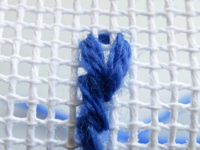
Step 4 – Repeat steps 2 and 3 until you have the desired column height, ending with step 2.
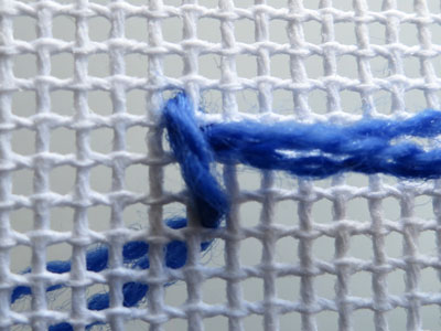
Step 5 – Bring needle up two squares to the right.
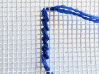
Step 6 – Insert the needle three squares down and one square to the left.
Step 7 – Bring needle up one square up and one square to the right. Repeat steps 6 and 7 until you are at the end of the column.
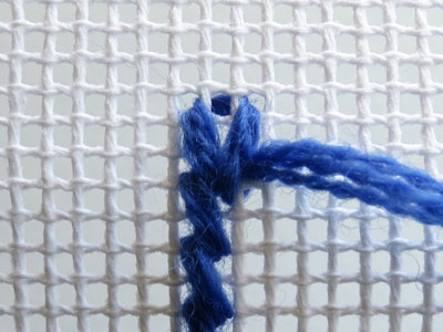
Step 8 – To start a new column in the same colour bring the needle up two squares to the right.
The mystery continues
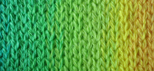
No one has cracked the mystery of how the Green/Blue study was made yet. Here is a clue and a photo of the Green/Yellow part.
Think outside – and over – the square.. we first go up and then down again.
Guess how this was made and win 5 mini merino skeins
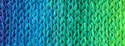
I am running my first competition today. The first person to guess how my Blue/Green study above was made will win 5 mini merino skeins from the Marta’s Yarns collection of Merino lace weight mini skeins. You get to pick your own colours too!
Email your answer to pat@patriciacantosdesign.com
Pat
Defiant design celebrates 50 years
This year Marimekko is celebrating the 50th anniversary of the Unikko floral pattern. In 1964, Marimekko’s founder Armi Ratia announced that Marimekko would never print a floral pattern saying that flowers should only bloom in nature. In protest, designer Maija Isola created an entire collection of floral patterns – one of these was Unikko (poppy). The design was bold and resonated with the 60s flower power revolution.
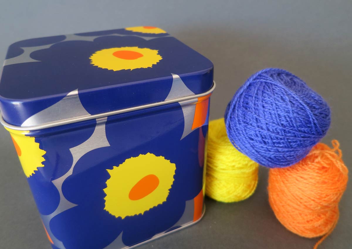
I visited the Marimekko store in Chapel Street Melbourne last week to see the Unikko design first-hand. I came away with this small tin printed with the Unikko design which I am now using to keep teabags. My two-year old son Leo spotted it as soon as he walked into the kitchen. It’s striking design and use of color got me thinking about color theory and design.
The colors used for this particular Unikko pattern use the split-complement color theory. This theory calls for the key hue (color) to be combined with the two hues that lie adjacent to its opposite hue. The Unikko design demonstrates this well in it use of blue-violet as the key hue together with yellow and orange – being the colors either side of yellow-orange on the color wheel. I got my color wheel out to check and the result can been seen in the picture below.
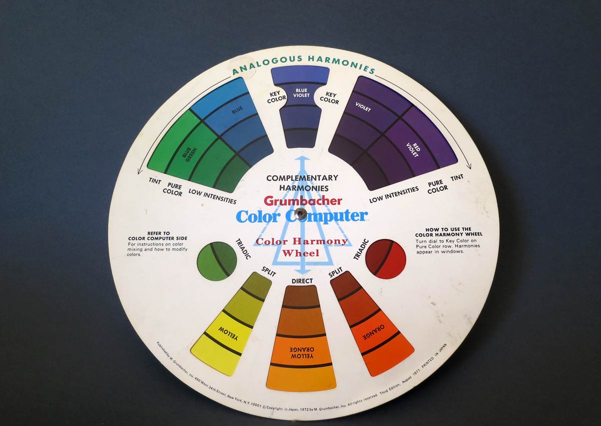
Faber Birren’s seminal text “Creative Color” explains the theory of the split-complement and makes a few suggestions when using complementary colors that we also see at play in the Unikko design. In particular, he notes that cool hues such as blue and violet make ideal backgrounds. Warm colors, such as red and orange are more advancing and make better feature hues than background hues.
Inspired by this story of courage in design and the beautiful use of color on my much admired tea tin, I have gathered some colors in my collection of 2ply merino yarn and will start a new design this week. I will keep you posted on progress. Time for a tea break…