Defiant design celebrates 50 years
This year Marimekko is celebrating the 50th anniversary of the Unikko floral pattern. In 1964, Marimekko’s founder Armi Ratia announced that Marimekko would never print a floral pattern saying that flowers should only bloom in nature. In protest, designer Maija Isola created an entire collection of floral patterns – one of these was Unikko (poppy). The design was bold and resonated with the 60s flower power revolution.
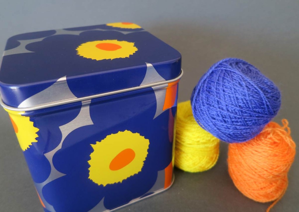
I visited the Marimekko store in Chapel Street Melbourne last week to see the Unikko design first-hand. I came away with this small tin printed with the Unikko design which I am now using to keep teabags. My two-year old son Leo spotted it as soon as he walked into the kitchen. It’s striking design and use of color got me thinking about color theory and design.
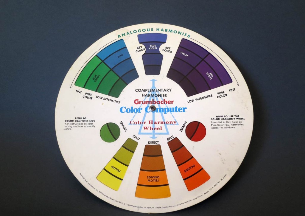
The colors used for this particular Unikko pattern use the split-complement color theory. This theory calls for the key hue (color) to be combined with the two hues that lie adjacent to its opposite hue. The Unikko design demonstrates this well in it use of blue-violet as the key hue together with yellow and orange – being the colors either side of yellow-orange on the color wheel. I got my color wheel out to check and the result can been seen in the picture below.
Faber Birren’s seminal text “Creative Color” explains the theory of the split-complement and makes a few suggestions when using complementary colors that we also see at play in the Unikko design. In particular, he notes that cool hues such as blue and violet make ideal backgrounds. Warm colors, such as red and orange are more advancing and make better feature hues than background hues.
Inspired by this story of courage in design and the beautiful use of color on my much admired tea tin, I have gathered some colors in my collection of 2ply merino yarn and will start a new design this week. I will keep you posted on progress. Time for a tea break…


